3. Computer Aided Design

My previous experience of computer aided design has been based on using 3DS Max, a 3D modelling tool. I have used 3DS Max for basic character animation and later for creating models for 3D printing. When I studied at Fab Lab Limerick, I learnt that Adobe Illustrator was also a powerful tool for creating 3D parts via lasercutter. Previously I had only used Illustrator for print and packaging projects – But there is also the potential to use it for engraving and cutting plastic, wood and textiles.
Antimony 3D
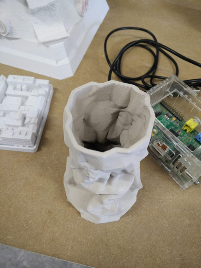
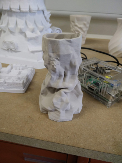
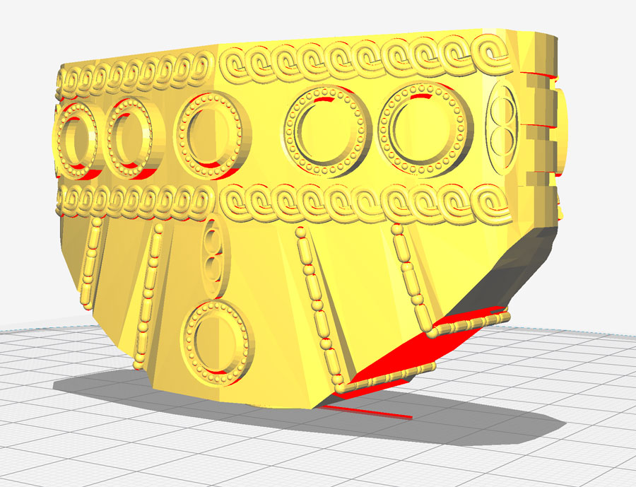
I started my work on this section using Antimony. I was aware this tool was used in a ceramic 3D printing workshop and practical in making organic, random 3D shapes. The vases above was created with a DeltaWASP 2040 during this workshop. What is fascinating about this vase is the internal shape, which would be very difficult to achieve by hand or in other software.
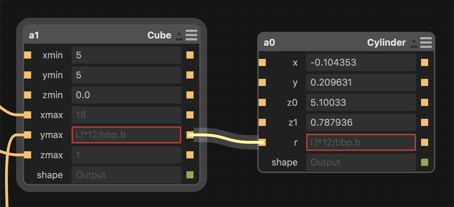
I worked through the basic tutorials for Antimony on the Fab Lab website. Using the node system was confusing at times – Knowing which node was for which object as the amount increased. Also because there is no visual difference between eg. a transform and an object, you have to be very organised with your naming conventions. It was easy to put formulas in the wrong position and for them not to register.
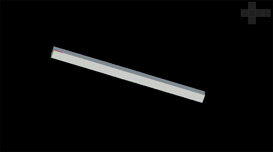
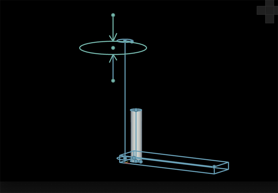
I found it challenging to 'get creative' with Antimony: After doing some basic tutorials I found I was unable to vary the parameters of a model to change it. It usually resulted in the model disappearing or having no effect. Writing math-based formulas from scratch would be extremely difficult.
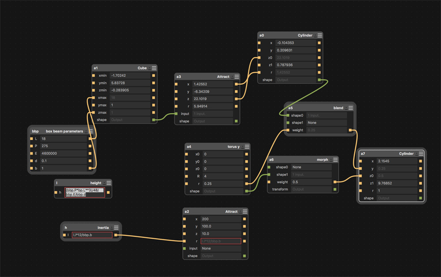
Perhaps if formulas were available in a dedicated menu, or as a cheat sheet, it would be easier to experiment. Some design programs offer a preview of the effect of high or low numbers on a model. I think that with the right formulas applied to a basic 3D model it would be possible to create something really unique.
Rhino
I followed a couple of beginner tutorials from the Rhino website. The first tutorial (Overview of the Rhino for Windows user interface) introduced the UI including the command line for access different features. Rhino has great options for removing clutter from the interface, something 3DS Max is not good at and often appears daunting to beginners.
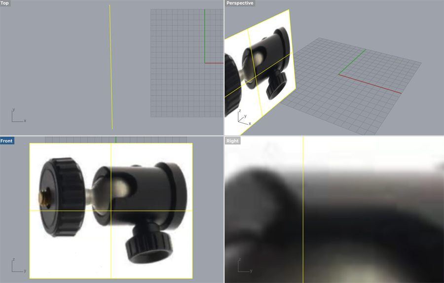
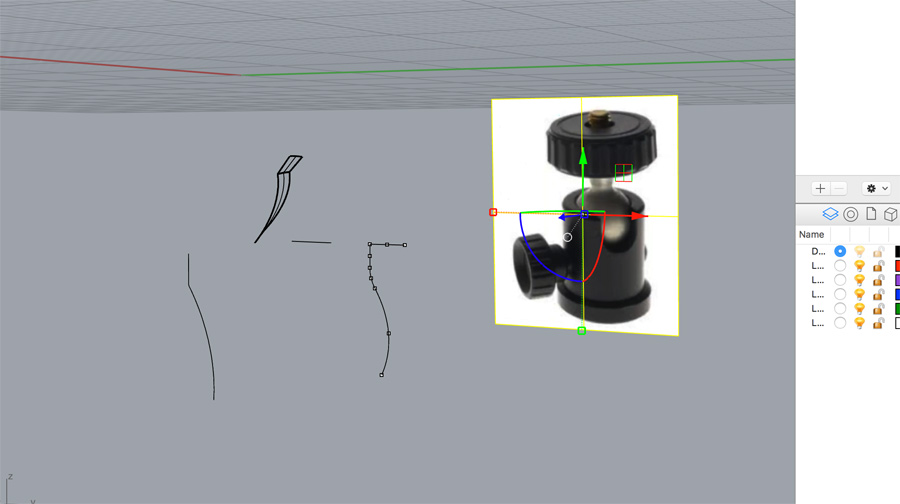
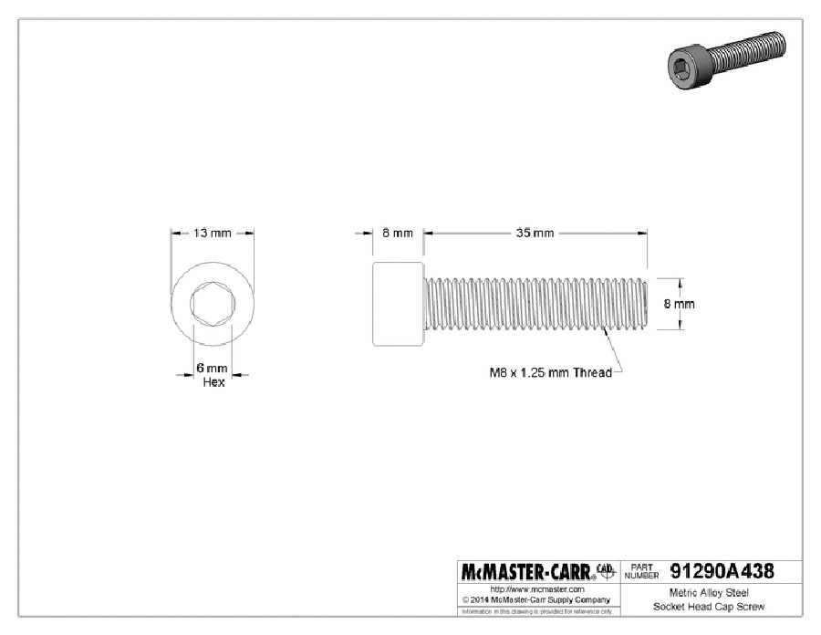
The second tutorial (Getting started with Rhino for Mac- Knobby) was extremely challenging: The aim was to create an adjustment knob, based on a screenshot. The tutorial started clearly indicating how the knob would be brought together using different parts. It introduced a website (McMaster-Carr) where cad files for parts can be downloaded and imported. This has great practical ramifications – For example, a screw file with all the threads matching real world dimensions would be a huge task to model.
From here I worked with the line tool to create a matching cylindrical part to the screenshot. This proved challenging as Rhino's line tool operate really differently to Adobe Illustrator or 3DS Max. When it was time to lathe or 'revolve' the part, I found my model extending in different directions to what I expected.
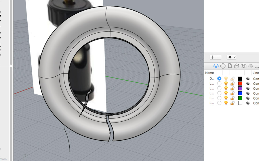
I don't feel this tutorial is a good match for a beginner and, in hindsight, it may have been better to pick another tutorial such as Intro to 3D Modeling with Rhinoceros for Mac.
Inkscape
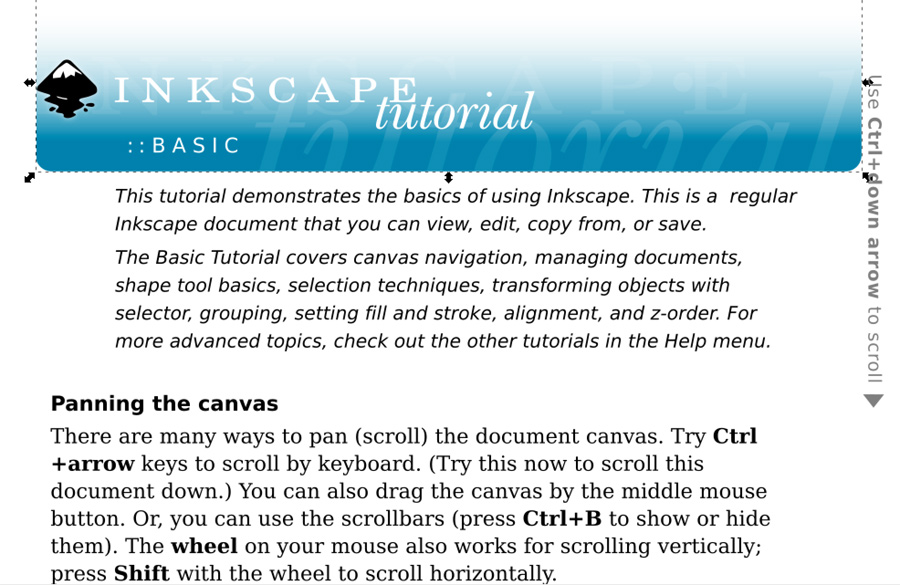
I used the tutorials available under Inkscape's Help section to gain an understanding of the software. The program is vector-based and operates similarly to Adobe Illustrator except that the main file type is svg.
For my final project, the inclusion of a mobile app to track the scoreline could would be designed with different tools: Vector-based (Inkscape) to prepare the app's brand elements (logo, iconaugraphy) and pixel-based (Gimp), to establish the app's interface and layout.
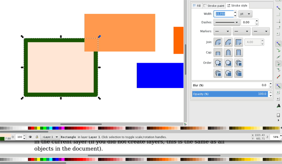
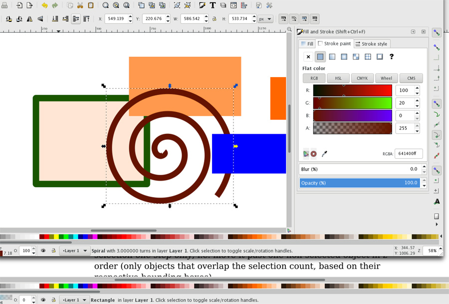
I started with simple rectangles, moving and resizing across the screen. After this, I was able to locate different menus for arranging and recolouring objects, including fills and strokes. This was of key importance because we intended to use different colours to represent different settings in our lasercutter test.
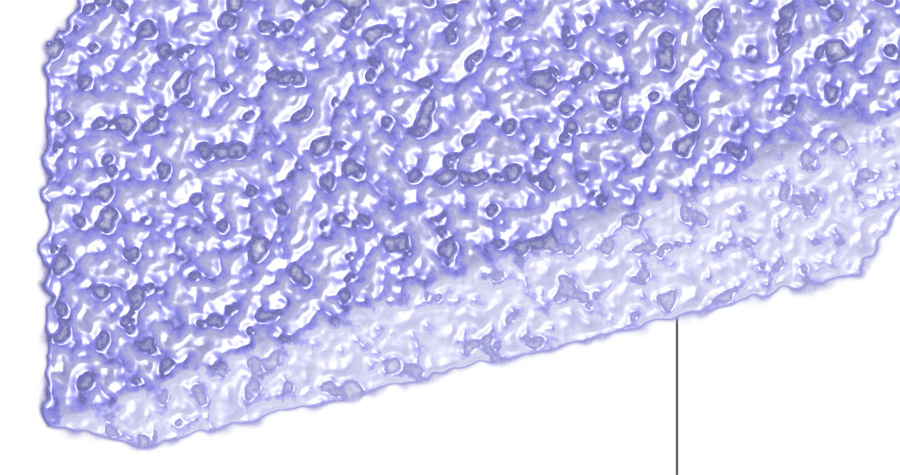
Is is possible to cut shapes out of one another similar to Illustrator's pathfinder tool. I experimented with the 3D Box tool. This is actually very useful for preparing illustrtrations. If I am creating an isometric landscape, it can be useful to define the basic planes in advance, then add character. Inkscape also have a number of filters (eg. Bumps > Bubbly Bumps) which work well on 3D shapes and would be useful for quick renders of hand-drawn sketches.
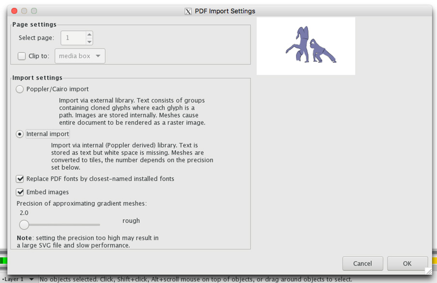
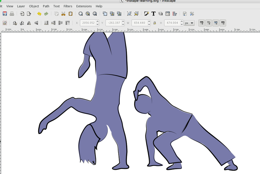
It is possible to open Illustrator files (.ai) in Inkscape. Some information on fills/strokes is lost, but Inkscape does a good job of keeping the objects in tact. I think generally it's be better not to switch programs mid job, but as the Sorbonne's lasercutter is only working with Inkscape, I will continue to test import variations between it and Illustrator files.
Fusion 360
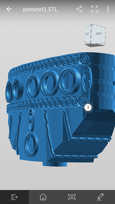
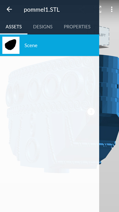
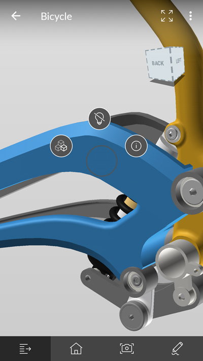
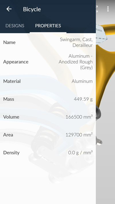
I have been keen to try Fusion 360 for some time, based on the recommendation of several people involved in product prototyping. I previously downloaded the mobile app, where I could open and discuss .stl files with clients. Files created in other software display but don't give the detailed information as those created in Fusion directly.
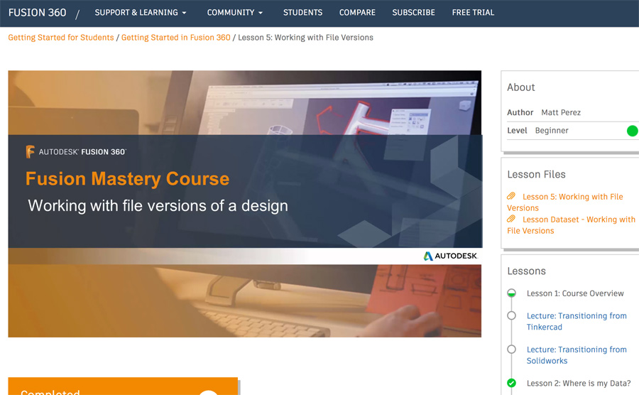
I used Autodesk's own tutorial library to get the basics of learning Fusion. Early tutorials present a way of saving using version control, similar to Git. The timeline style interface reminds me of Photoshop's animation tab. The browser review/comment system appears to match the mobile app.
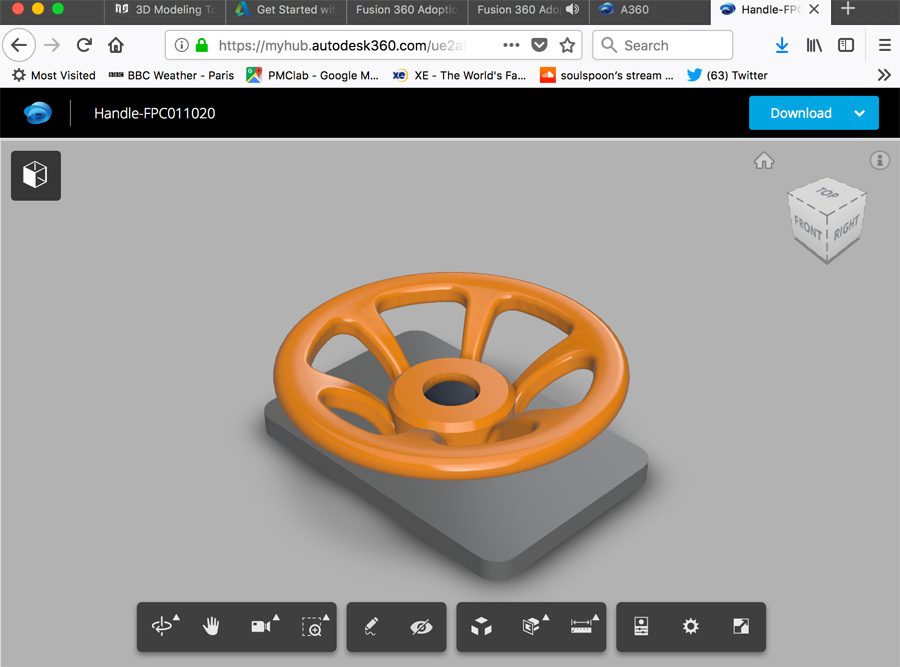
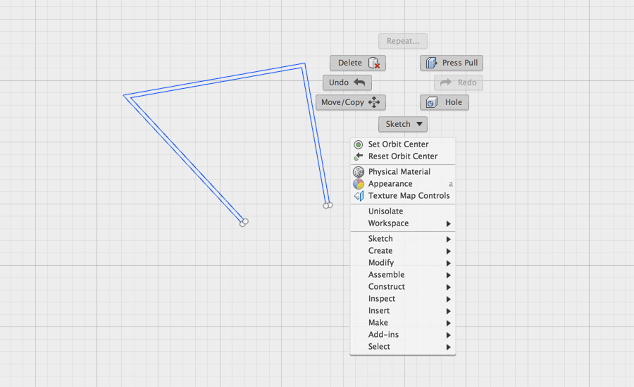
The way folders are structures is similar to another Autodesk software I have tried, Revit. You access deeper menu options with a right-click and the Esc key to deselect a tool. The use of gesture – swiping in the same angle as non-visible menu items – is a novel way of working. I'm sure this speeds up workflow for exprerienced users.
I appreciate Fusion's display setting Perspective with Ortho Faces. This is a similar way to viewing 3d models that would allow me to work precisely and not obscure a model in the wrong direction.
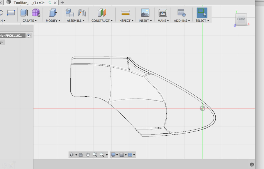
A 3D Model
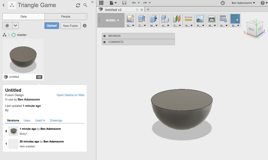
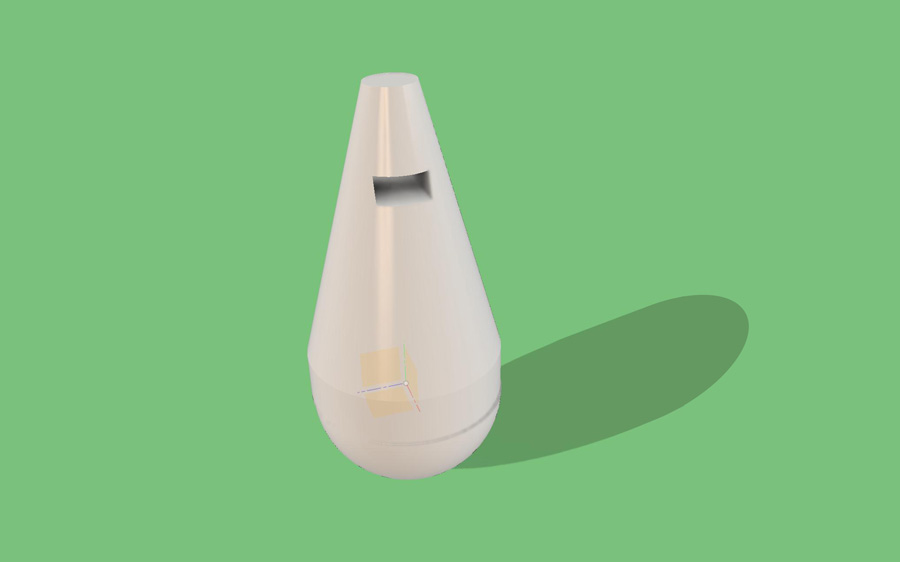
I used the information from the Fusion tutorials to start me on the road to a basic 3D prototype. I started by creating a sphere body which I combined with a cylinder. I used the cylinder to cut away half of the sphere, creating a hemisphere.
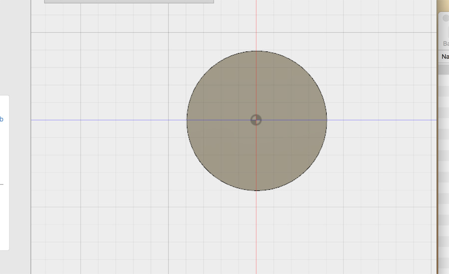
I am conscious it is quite easy to misalign elements when 3D modelling shapes. I repositioned the hemisphere on the x and y-axis using the move tool, so it was exactly at 0,0. This made it easier to position the preceding parts.
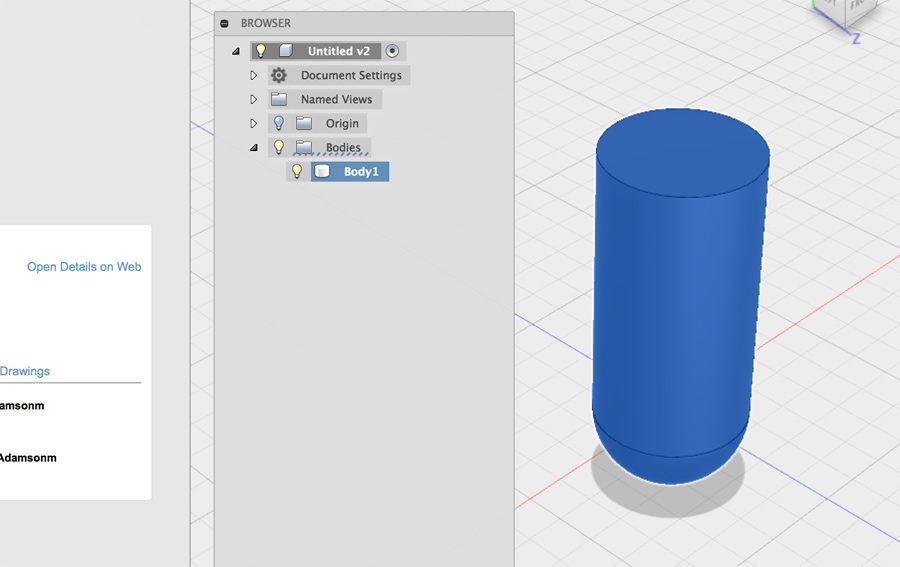
I created a cylinder in the same component group, but found when I wanted to go back in a parametric way, the cylinder alone was inaccessible. I therefore used went back and defined a separate component for the cylindrical part. I selected the top face of the cylinder and chamfered it inward.
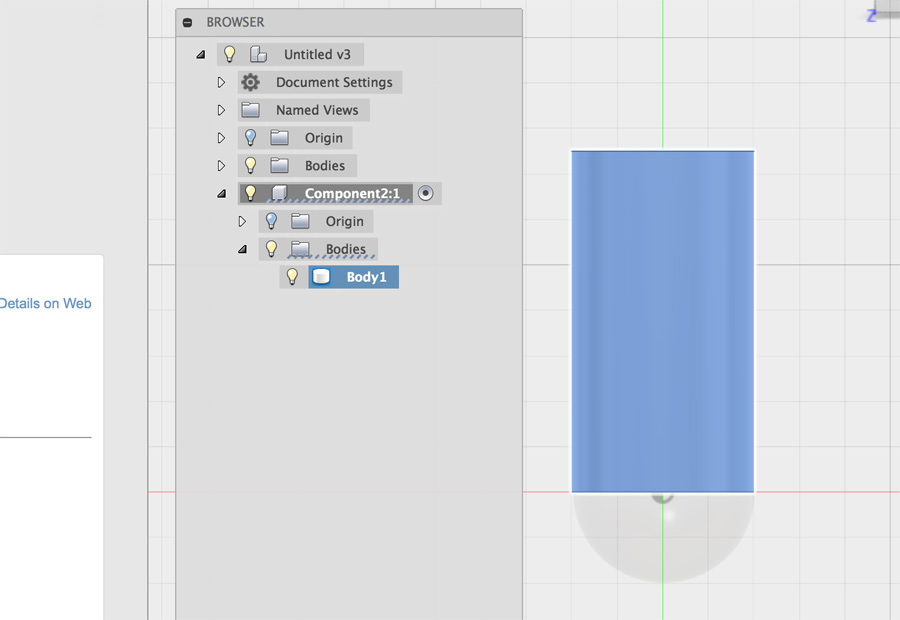
At this point I had the basic shape of the buoy I was looking to achieve – A base that right itself when knocked and a body rising up at an appropriate height. There is a lot left to consider: The correct dimensions for use in the game and how hollow sections (for counter weight and sensors) will be positioned. The overall aesthetic shape needs more work also.
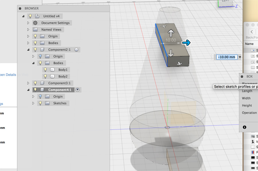
I attempted to boolean a hole in the cylindrical section. This proved quite different but easier than 3DS Max – You use a system of cutting objects and there is much less prep required. Boolean in 3DS Max required that you break the model into an editable mesh and this means you lose history on the object.
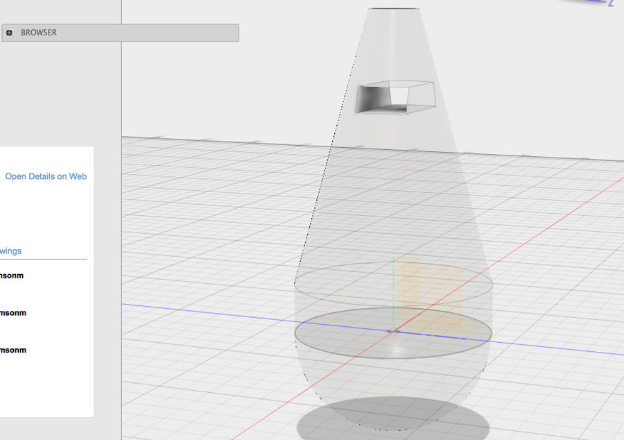
In a final step, I tested the rendering workspace, including camera depth and environmental settings. I also applied a rubber/silicone material to the model.
