Hero Shot
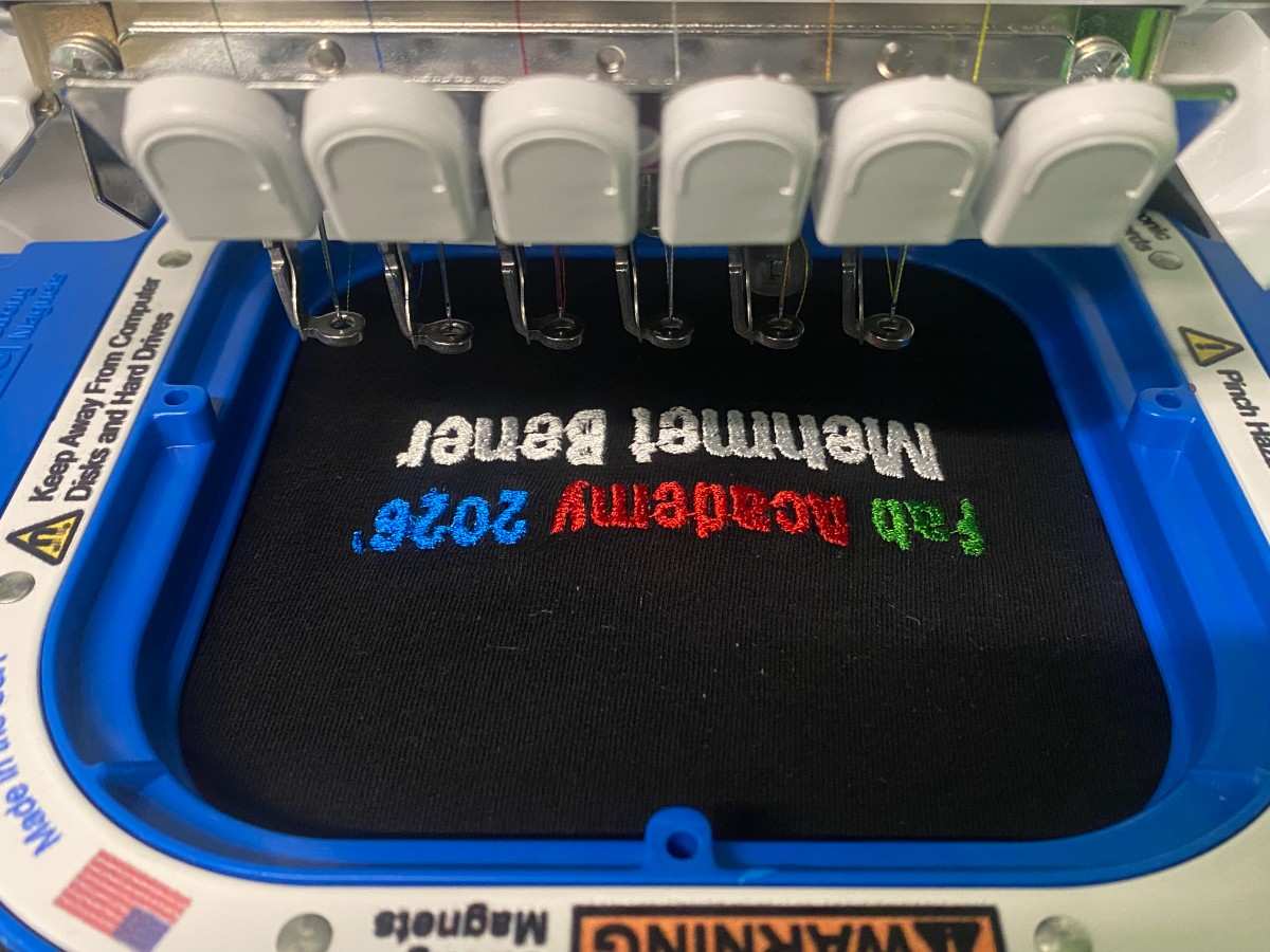
For Wildcard Week, I used the Brother embroidery machine to embroider a custom design onto a black t-shirt. My design was a simple personalized Fab Academy logo/text design that said:
Fab Academy 2026'
Mehmet Bener
I designed the graphic in Canva, converted it into an embroidery file using the embroidery software, loaded a black t-shirt into the embroidery hoop, selected the thread colors, and used the Brother embroidery machine to stitch the design onto the fabric.
The final embroidery used four thread colors:
- Green for “Fab”
- Red for “Academy”
- Blue for “2026’”
- White for “Mehmet Bener”
Goal of the Week
My goal for this week was to learn a digital fabrication process that I had not used before. I wanted to try textile embroidery because it combines digital design with a physical textile output. Unlike vinyl cutting or laser cutting, embroidery creates the design by stitching thread directly into fabric.
For my final output, I decided to make a personalized Fab Academy t-shirt. I wanted the design to be simple, readable, and meaningful for this year of Fab Academy.
Process
Machine Used
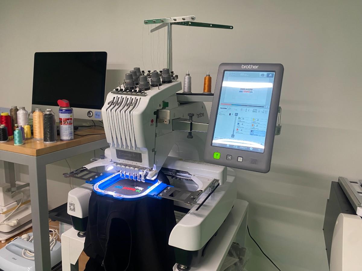
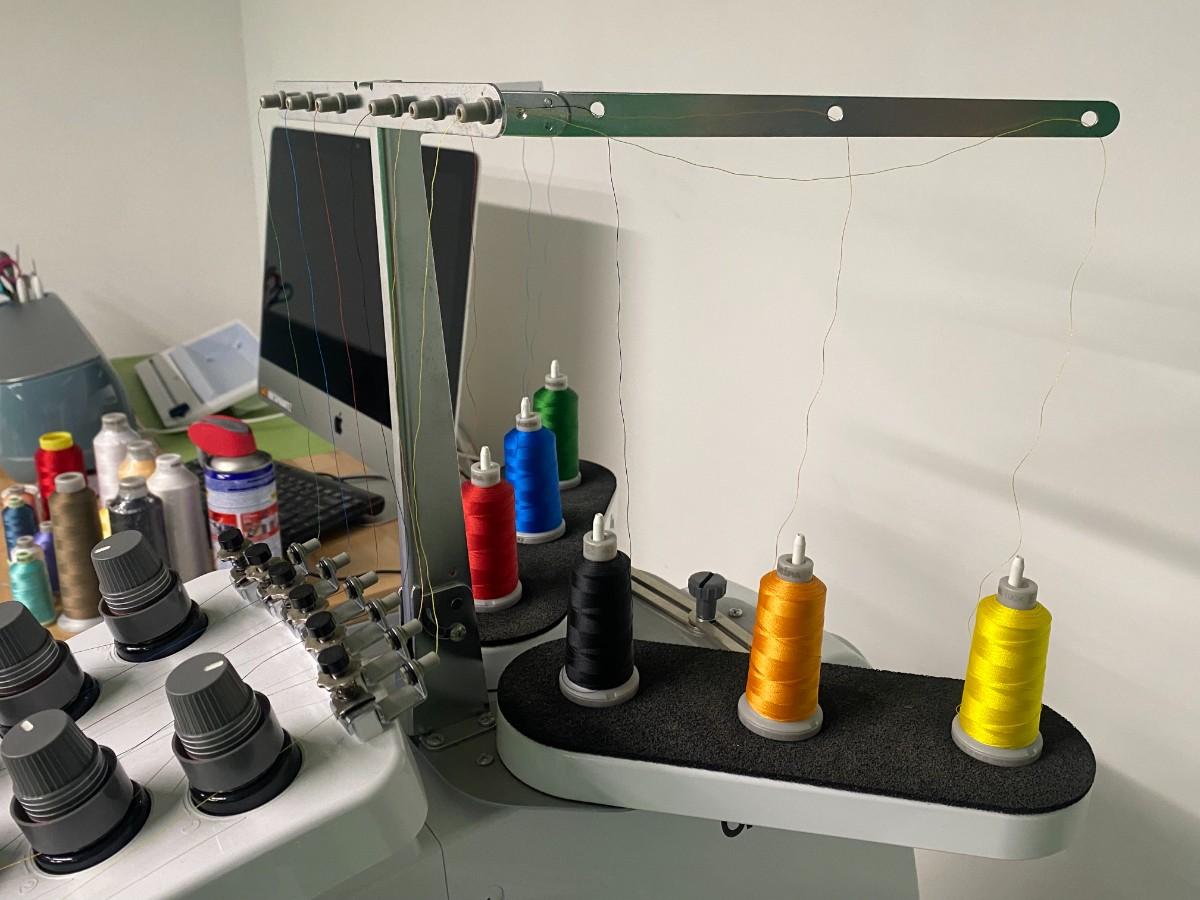
I used a Brother multi-needle embroidery machine. The machine can hold multiple thread colors at the same time and automatically switch between the selected colors during the embroidery process.
This was useful for my design because I used four different colors. Instead of manually re-threading the machine for every color change, the machine could use different needles for different thread colors.
The machine included:
- Multiple thread spools
- Multiple needles
- Embroidery hoop
- Built-in touchscreen interface
- Automatic stitching process
- Color-based embroidery sequence
Materials and Tools
| Material / Tool | Purpose |
|---|---|
| Brother embroidery machine | Main fabrication machine |
| Black t-shirt | Final fabric material |
| Embroidery hoop | Holds the fabric flat and tight |
| Embroidery thread | Creates the stitched design |
| Green thread | Used for “Fab” |
| Red thread | Used for “Academy” |
| Blue thread | Used for “2026’” |
| White thread | Used for “Mehmet Bener” |
| Canva | Used to design the original graphic |
| Embroidery software | Used to convert the image into stitches |
| Stabilizer / backing material | Helps support the fabric during embroidery |
Design
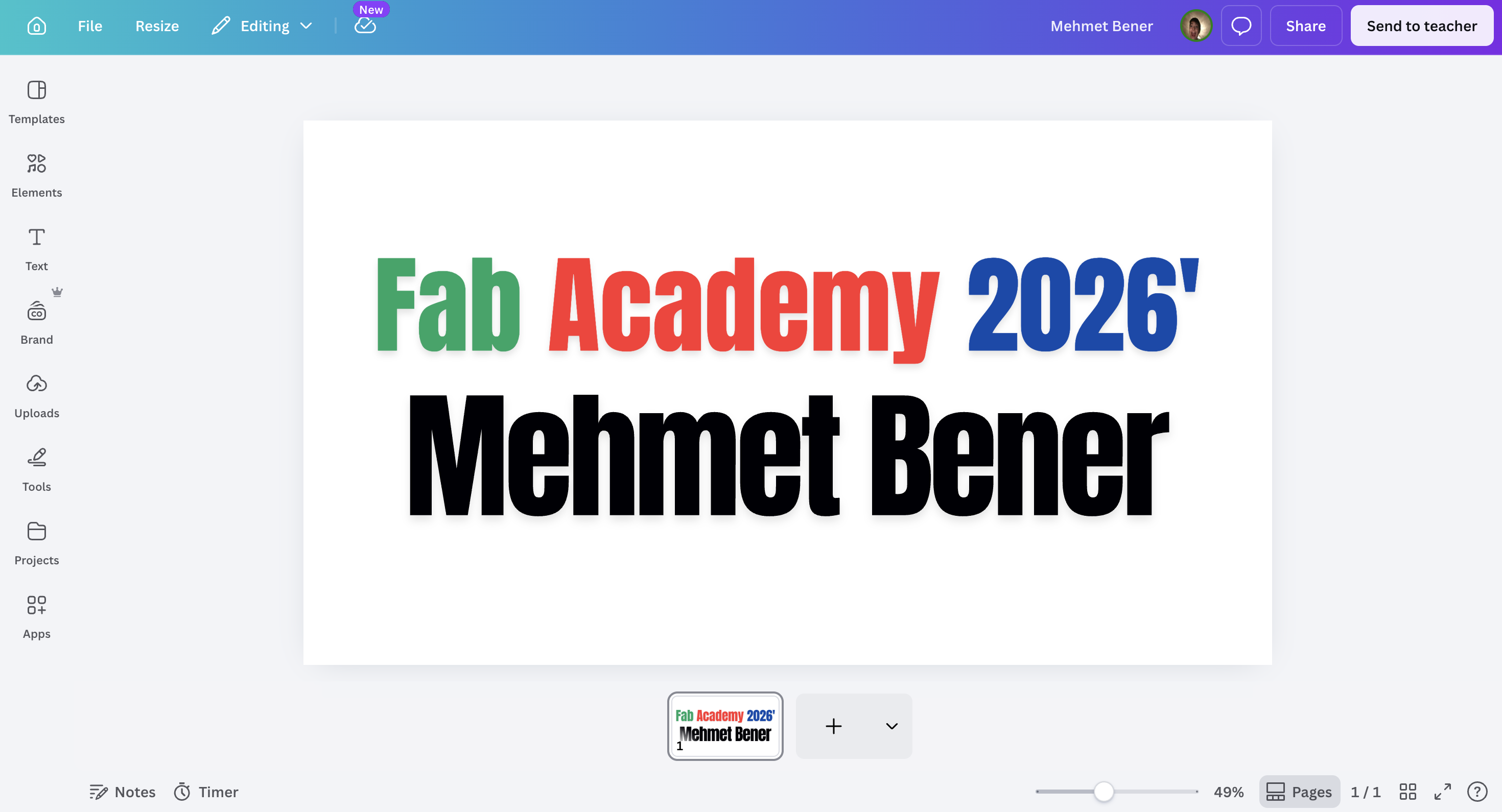
I started by designing the text graphic in Canva. I made a simple design with two lines of text:
Fab Academy 2026'
Mehmet Bener
I used large, bold text because embroidery has a physical stitch resolution. Very small or very thin text can become difficult to stitch clearly. Since my design was going onto a t-shirt, readability was important.
I also used different colors to make the design more interesting:
- “Fab” was green.
- “Academy” was red.
- “2026’” was blue.
- “Mehmet Bener” was black in the digital design, but I changed it to white thread for the actual t-shirt because the fabric was black.
This color decision was important because black text would not be visible on a black t-shirt. White thread created strong contrast and made the name readable.
Preparing the Embroidery File
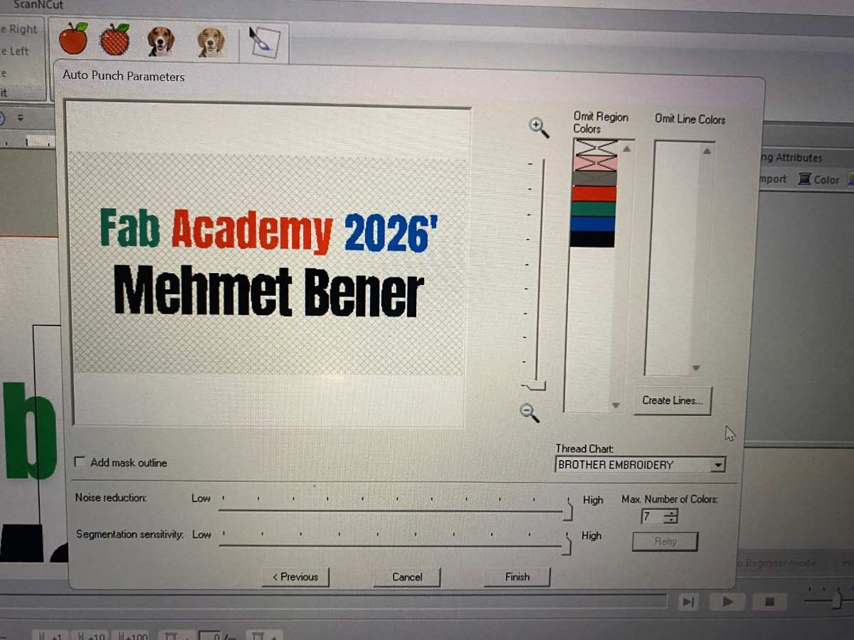
After designing the graphic, I imported it into the embroidery software. The software converted the visual design into stitch regions. This step is important because the embroidery machine does not directly understand a normal image file like a PNG or JPG. It needs an embroidery file that contains stitch information.
In the embroidery software, I checked the design preview and the color regions. The software separated the design into multiple thread colors. I selected the thread chart and prepared the design for the Brother embroidery machine.
The software showed the design with its separate color areas. This allowed me to confirm that each word would be stitched in the correct color before sending it to the machine.
The main settings I had to consider were:
- Number of colors
- Stitch density
- Text readability
- Design size
- Placement on the shirt
- Color order
- Whether small parts of the text would be too detailed
Because my design was mostly bold text, it worked well for embroidery.
Preparing the Machine
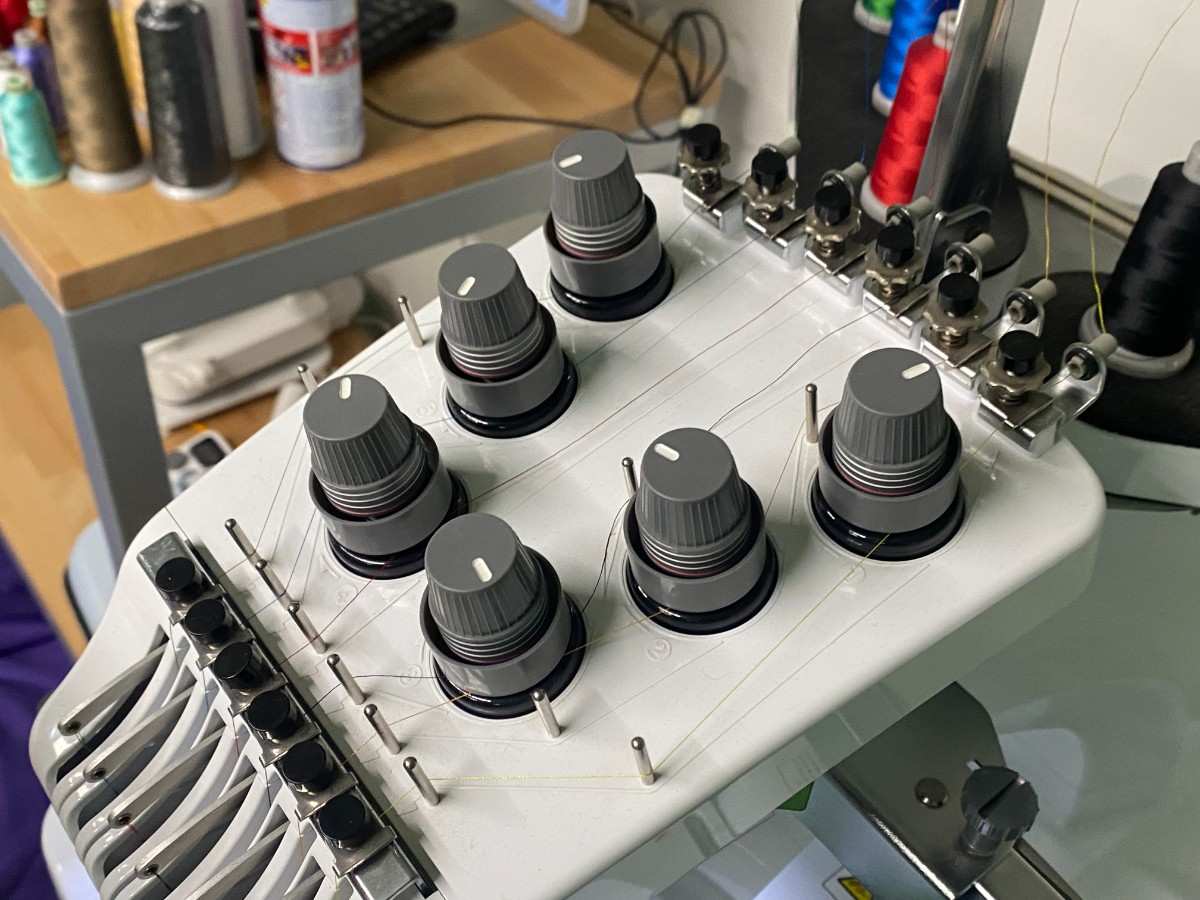
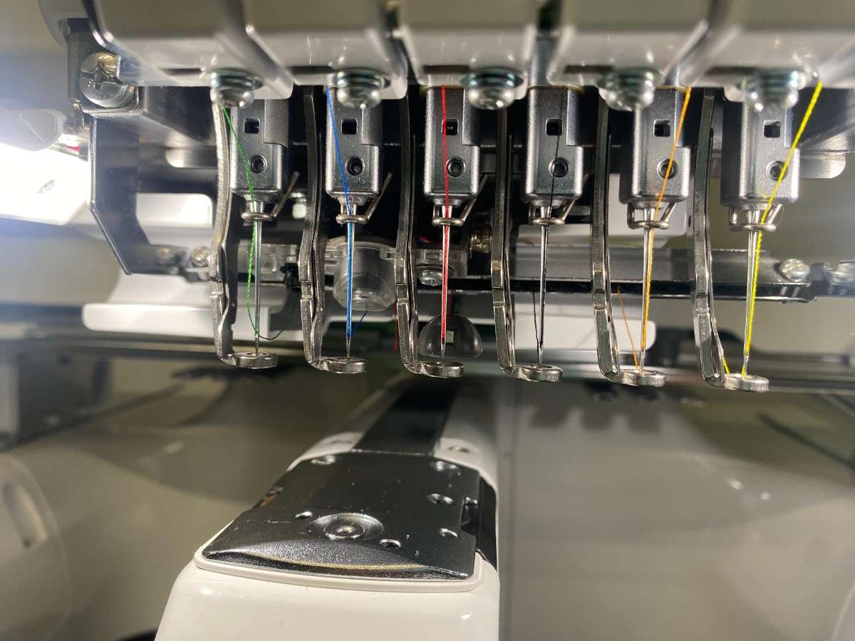
Before starting the embroidery, I prepared the machine with the correct thread colors. The Brother machine has multiple needles, so each color can be loaded onto a different needle.
For my design, I needed green, red, blue, and white. I loaded the required thread colors onto the machine and made sure the threads were routed correctly through the guides and needles.
The machine setup included:
- Loading the thread spools.
- Passing each thread through the correct thread path.
- Checking that the threads reached the correct needles.
- Making sure the bobbin and top threads were ready.
- Loading the embroidery file into the machine.
- Checking the design position on the machine screen.
- Confirming the color order before starting.
The machine interface showed the design preview and the different colors that would be stitched.
Loading the T-Shirt
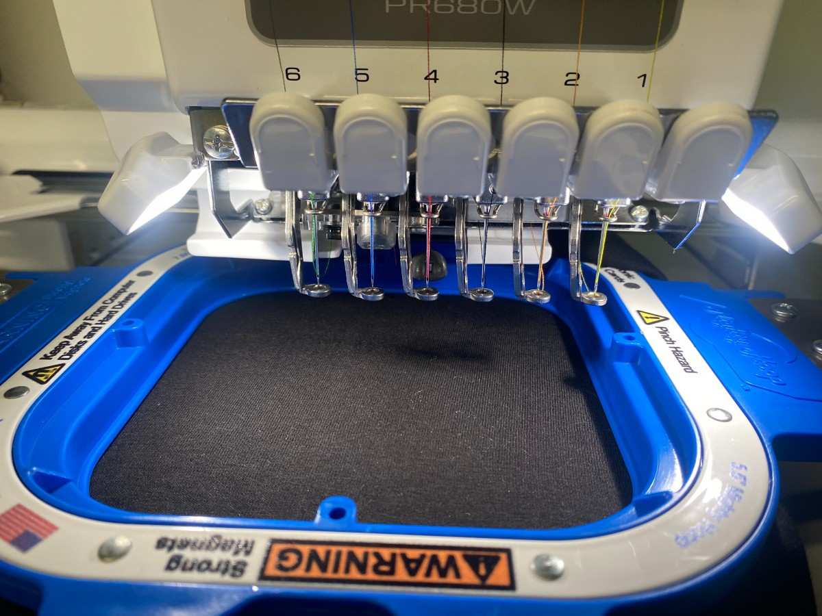
Next, I loaded the black t-shirt into the embroidery hoop. This was one of the most important steps because the fabric needs to stay flat and tight during embroidery.
If the shirt is loose, wrinkled, or not aligned properly, the stitched design can become distorted. Since my design contained text, alignment was especially important. Even a small shift could make the final result look uneven.
I placed the t-shirt in the hoop and tried to position the design area in the correct location. The hoop held the fabric while the machine moved the needle over the design area.
The important checks before stitching were:
- The t-shirt was flat inside the hoop.
- The design area was centered.
- The fabric was tight enough.
- The shirt was not folded under the hoop.
- The embroidery area had enough space.
- The machine head could move without hitting anything.
Embroidery Process

After the t-shirt was loaded and the file was ready, I started the embroidery process. The machine stitched the design color by color.
The machine followed the stitch path from the embroidery file. It used the selected thread colors to create the text directly on the fabric. Since the design had multiple colors, the machine stitched each color section separately.
The process was:
- The machine started stitching the first color.
- It completed one color region.
- It moved to the next color.
- The next needle/thread color was used.
- This continued until all text was finished.
During the process, I watched the machine carefully. This was important because embroidery can fail if the thread breaks, the shirt shifts, the needle hits a problem, or the fabric becomes loose.
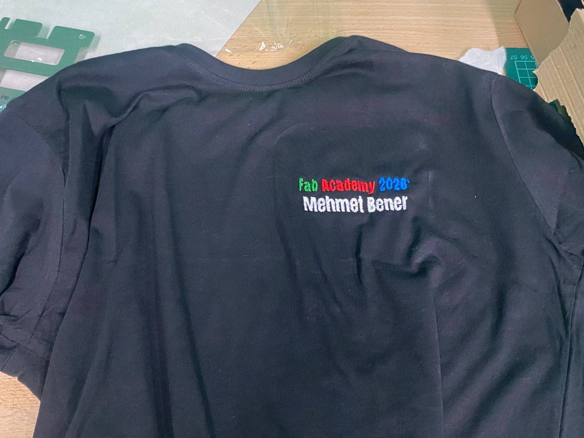
The machine stitched the colored text onto the black t-shirt. The final result was readable and the colors were clearly visible.
Final Result
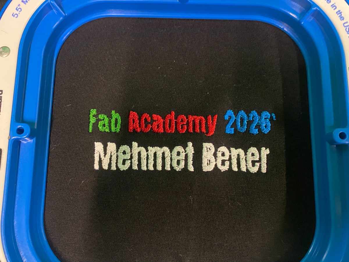
The final embroidered design successfully showed:
Fab Academy 2026'
Mehmet Bener
The colored text stood out well against the black t-shirt. The green, red, and blue colors made the first line more visually interesting, while the white thread made the name easy to read.
The embroidery created a much more permanent and textured result compared to printing or vinyl. Since the design is stitched into the fabric, it has a physical surface and feels more integrated with the textile.
What Worked Well
The design worked well because it was simple and bold. Large text is easier to embroider than thin or highly detailed shapes. The color choices also worked well on the black t-shirt.
Using white thread for the name was a good decision because it created strong contrast. If I had kept the name black like in the Canva design, it would not have been visible on the shirt.
The Brother embroidery machine also made the multi-color process easier because it could hold several thread colors at the same time. This made the workflow cleaner and reduced manual thread changes.
The final t-shirt looked clean, readable, and personalized.
Problems and Challenges
Converting a Digital Design Into Stitches
The main difference between graphic design and embroidery is that embroidery is physical. A normal digital image can contain very sharp edges, small details, and perfect text, but the embroidery machine has to recreate that using thread.
This means that the design needs to be simple enough for the machine to stitch cleanly. Thin lines, tiny letters, or very detailed shapes can become messy. For this reason, I kept my design mostly as bold text.
Fabric Alignment
Another challenge was loading the t-shirt into the hoop correctly. If the t-shirt is not straight, the final design can be tilted. Since the design is text-based, any misalignment would be easy to notice.
I had to make sure the fabric was flat, tight, and placed in the correct position before starting the machine.
Color Contrast
The original Canva design used black for “Mehmet Bener,” but the t-shirt was also black. I had to adapt the design for the physical material and use white thread instead. This was a good example of how material choice affects digital fabrication decisions.
Thread and Stitch Quality
During embroidery, thread tension and stitch density matter a lot. If the tension is wrong, the stitches can look loose or uneven. If the density is too high, the fabric can become stiff or distorted. My design was simple enough that the machine produced a clean result.
Design Decisions
Why I Used Text
I chose a text-based design because I wanted the output to be personal and connected to Fab Academy. The t-shirt acts like a small wearable documentation piece for my Fab Academy year.
Text also helped me focus on the embroidery workflow instead of spending too much time on a complicated image. Since this was my first time using this embroidery process, a clear text design was a good starting point.
Why I Used Multiple Colors
I used multiple colors to test the machine’s ability to work with different threads. The design could have been made in one color, but using green, red, blue, and white made the result more interesting and helped me learn the multi-color workflow.
Why I Used a Black T-Shirt
The black t-shirt gave a strong background for the colored threads. The red, green, blue, and white threads all had good contrast against the black fabric.
The black fabric also made the final result look clean and professional.
Safety Notes
While using the embroidery machine, I kept my hands away from the needle area. The machine moves quickly and the needle can cause injury if touched while running.
I also made sure the hoop was properly attached before starting. If the hoop is not attached correctly, it can move incorrectly or cause the design to fail.
Important safety points:
- Keep hands away from the needle while the machine is running.
- Do not touch the moving hoop.
- Make sure the hoop is locked into place.
- Watch for thread breaks or fabric movement.
- Pause the machine before fixing any issue.
- Keep loose fabric away from moving machine parts.
Final Reflection
For Wildcard Week, I successfully used the Brother embroidery machine to create a personalized Fab Academy t-shirt. I designed the graphic in Canva, prepared it for embroidery, loaded the black t-shirt into the machine hoop, set up the thread colors, and embroidered the design onto the fabric.
The final result was a wearable object that says “Fab Academy 2026’ Mehmet Bener” in green, red, blue, and white thread. This project helped me learn how digital design can be converted into stitched textile output, and it showed me how important material setup is in machine embroidery.
This week was different from electronics, CNC, laser cutting, and 3D printing because the final material was soft fabric instead of a rigid material. It helped me expand my understanding of digital fabrication into textiles.