6. Feb 11th-17th: Circuit diagrams and layout design#
This week I’m finalising the electronic circuits I’m using, building them with ‘hard’ components on a breadboard, and figuring out the design of the ‘soft’ versions.
How it might look#
I want to use geometric shapes in the design of the synth modules. The chip I’m using as the oscillator - the part that generates the sound - actually has six oscillators in one chip, so I’m thinking it would be nice to have the oscillator module be a hexagon, and have six sides to attach sensors, each one controlling a different oscillator. Like this:

The keyboard, sequencer and filter modules are ‘bonus’ parts that I’ll make if I have time, and they’ll be attached to the outside of a sensor to further alter the sound / pitches.
Electronic Circuits#
For the actual electronics, I’m using a couple of simple circuits from Handmade Electronic Music by Nicolas Collins. I’ve ordered a bunch of parts and have started building them on a breadboard - here are some screenshots from the book to show what the breadboard versions of these, and the schematics, look like:

I’ll be using the following traditional / hard components
- CMOS integrated circuit chips
- Capacitors
- Audio jacks for connecting to a power supply, and sending a signal to a speaker
- Battery or other power supply
Some parts I’ll be making out of (e-) textiles, using conductive thread and fabric of various types:
- Circuit traces
- Resistors
- Potentiometers and other sensors
- The ‘circuit board’ itself (non-conductive rubber-coated textile)
And I might use some e-textile LEDs (SMD LEDs mounted on little PCBs with holes for sewing connection with conductive thread)
Next steps#
Because I want all the parts of my circuit to be visible (and aesthetically pleasing!), I need to do more work on figuring out where each trace of the circuit is going to go, which conductive material it’s going to be made out of, and how all the modules will connect together. I also have more work to do on developing the different sensors that will control the oscillators (I have no shortage of ideas, but haven’t transferred most of the documentation from my notebook to here yet ◉◡◉)
Also, as part of my documentation I want to include a guide on how to buy all the parts for this project - at the moment it involves navigating the (usually not-user-friendly) search engines on electronics websites, and when you’re doing it for the first time it can be tedious and tricky to figure out.
What I did for the rest of the week (not a lot)#
The sections above were written on Monday / Tuesday of week 6, covering what I did up until the end of the review session we had on Tuesday 12th. For the rest of the week I was home in Dublin, intending to get work done, but not really succeeding. But it was beneficial to take a step back from the project and have a change of scenery ó‿ó
Typography#
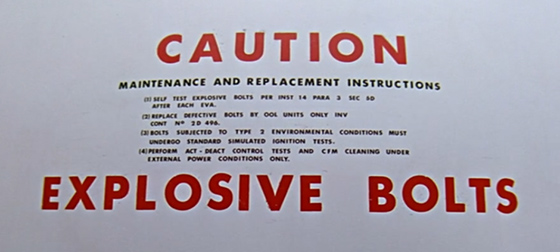
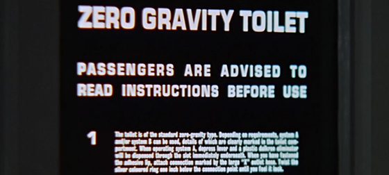
For both my documentation, and some instructions / labelling on the piece itself, I’ll need text! So I started thinking about what font (or fonts) I’ll use for that. As I want the whole thing to evoke a mid 20th Century sci-fi aesthetic, I did a Google Images search for 50s and 60s sci-fi book covers. A lot of the fonts I saw were a bit fussy for me (I like clean, sans serif fonts, for the most part), but I eventually stumbled on this great article that goes through all the fonts used in 2001: A Space Odyssey. Which was super handy, because apparently Stanley Kubrick had similar tastes in font style ಠ⌣ಠ
Like this:

And this:

And this:

Lots of inspiration! Here’s a list of fonts used in the film that future me might want to refer to in a couple of weeks:
And now some gifs from the film, because why not: